“Choosing the perfect paint color can make—or break—your home’s entire vibe. We talked to top interior designers to uncover their go-to shades (and the ones they’d never touch!). Save this guide before your next paint project!”
✅ The Paint Colors Designers LOVE
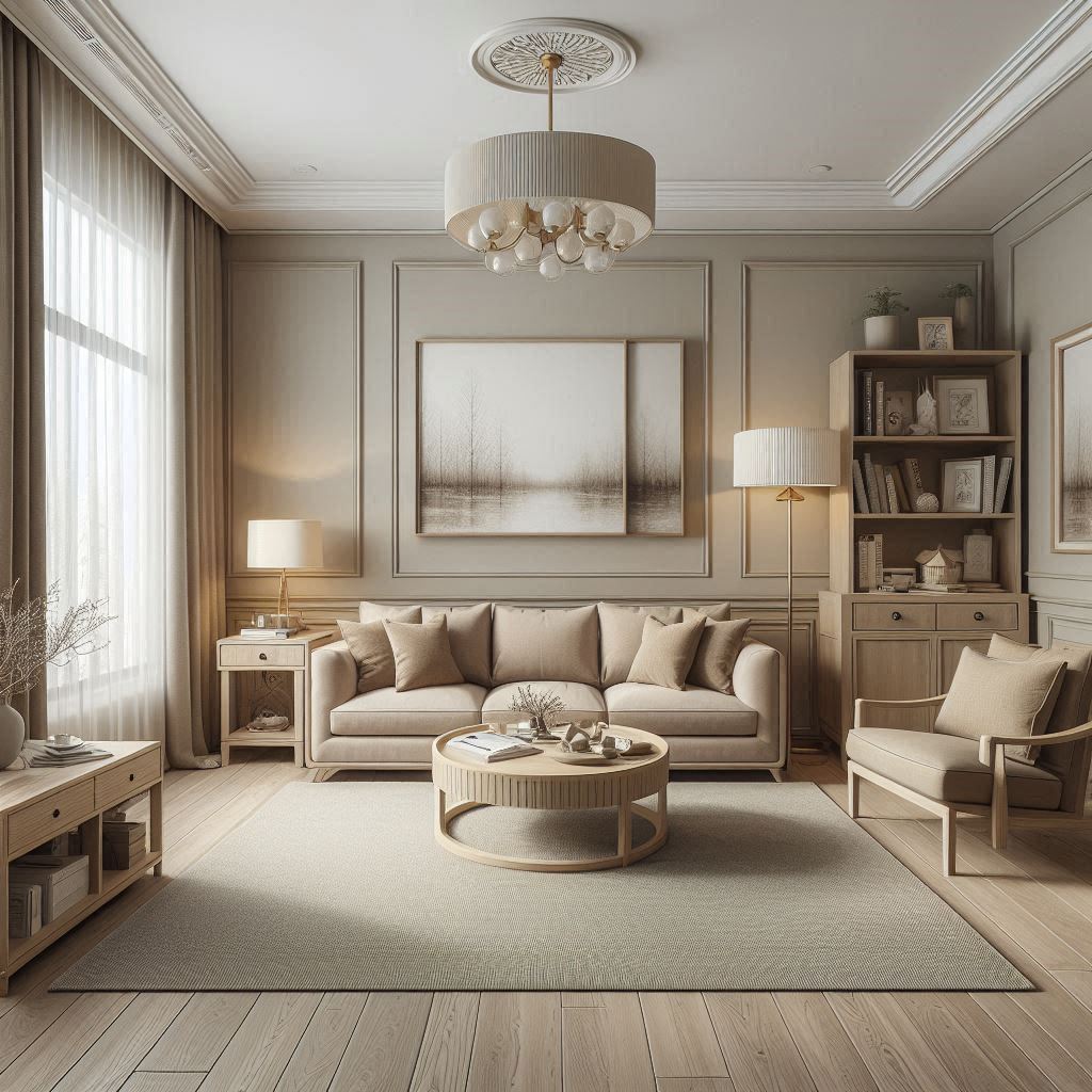
1. Sherwin-Williams Alabaster (The Ultimate Warm White)
- Why designers love it: Works in any light, pairs with every style (modern, farmhouse, minimalist).
- Best for: Trim, ceilings, and whole-room neutrals.
- Pro tip: Avoid pairing with cool grays—it leans creamy!
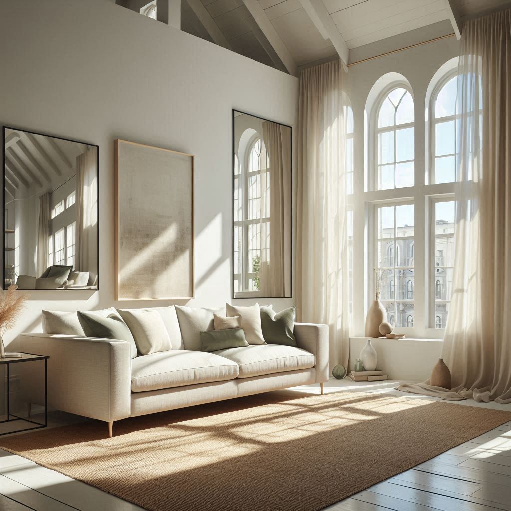
(“This White Paint Makes Every Room Look Bigger – Designers Adore It!”)
2. Benjamin Moore Hale Navy (The Perfect Moody Blue)
- Why it’s a favorite: Rich but not overwhelming, ideal for accent walls and cabinetry.
- Designer secret: Pair with brass hardware for a luxe look.
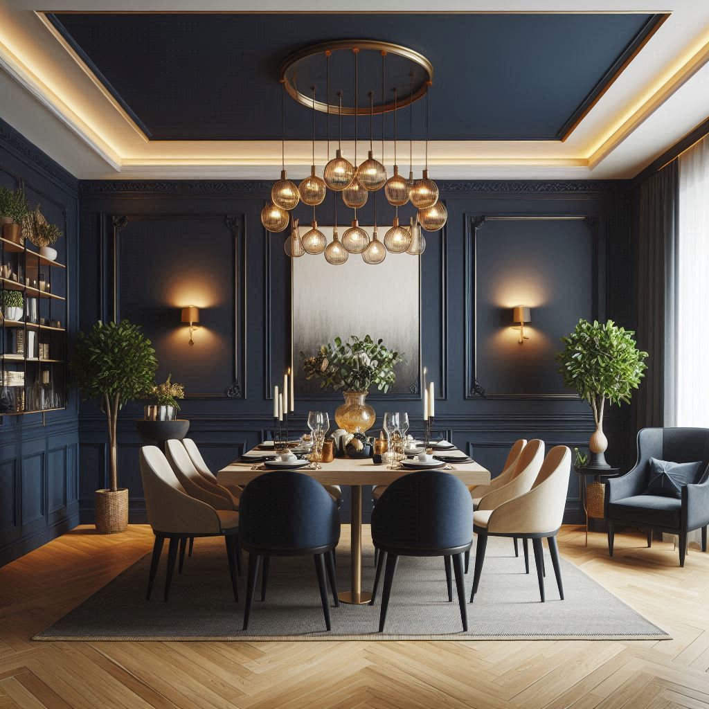
(“The Navy Blue Every Designer Uses – Instant Elegance!”)
3. Farrow & Ball Setting Plaster (The Cozy Pink-Beige)
- Why it’s trending: Warm, flattering, and gender-neutral—great for bedrooms and living rooms.
- Avoid if: Your room gets no natural light (can look muddy).
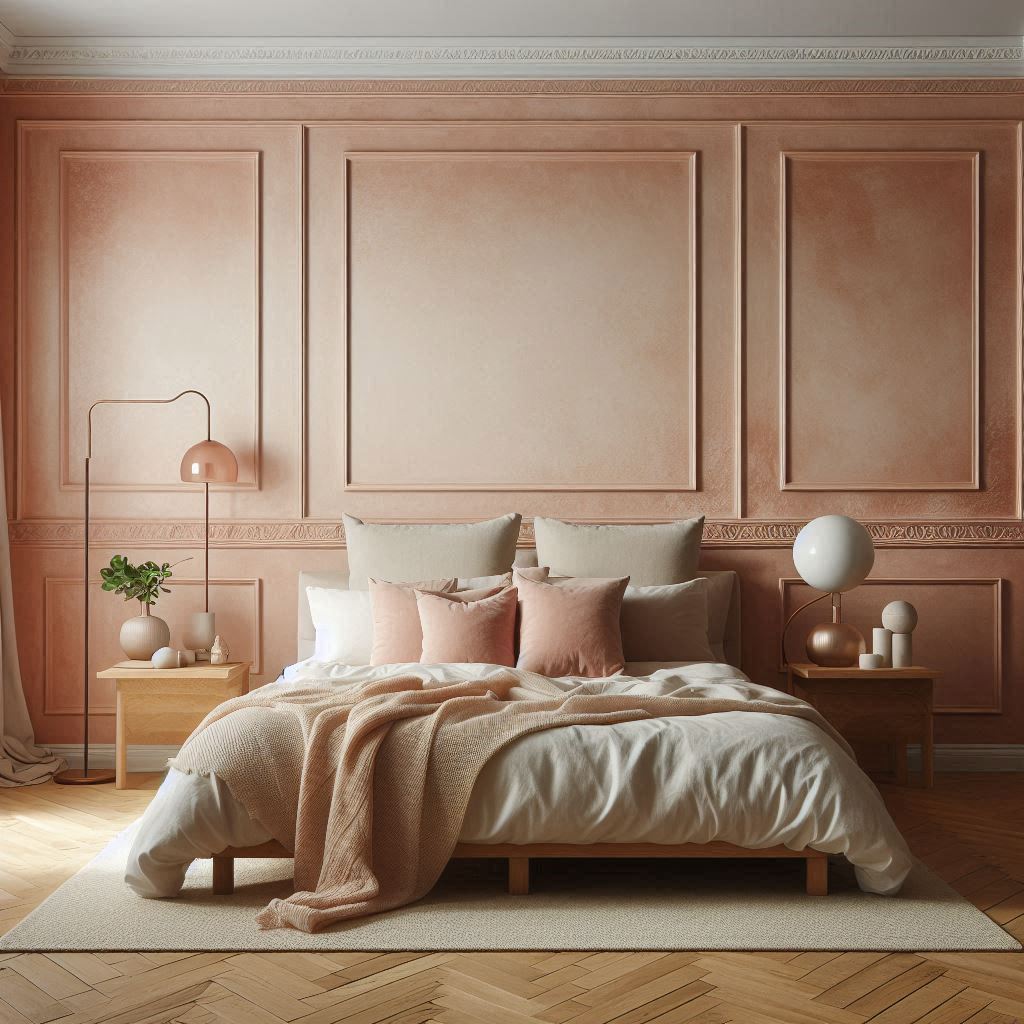
(“This Blush Paint Color Is Designer-Approved for 2025!”)
🚫 The Paint Colors Designers AVOID
1. Pure Bright White (Like Behr Ultra Pure White)
- Why it’s a no-go: Harsh, clinical, and shows every flaw.
- Fix it: Use Benjamin Moore Chantilly Lace (softer alternative).
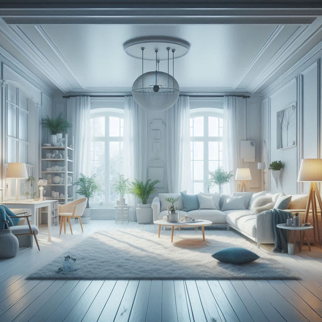
(“This White Paint Makes Your Home Look Cheap – Avoid It!”)
2. Builder-Grade Beige (Like Sherwin-Williams Accessible Beige)
- Why designers hate it: Dated, washes out rooms, and lacks personality.
- Try instead: Sherwin-Williams Agreeable Gray (warmer modern greige).
(“The Paint Color That Screams ‘Boring’ – Designers Skip This!”)
3. Trendy Dark Gray (Like Sherwin-Williams Iron Ore)
- The problem: Can make rooms feel like a cave (unless you have huge windows).
- Better option: Sherwin-Williams Peppercorn (lighter, more versatile).
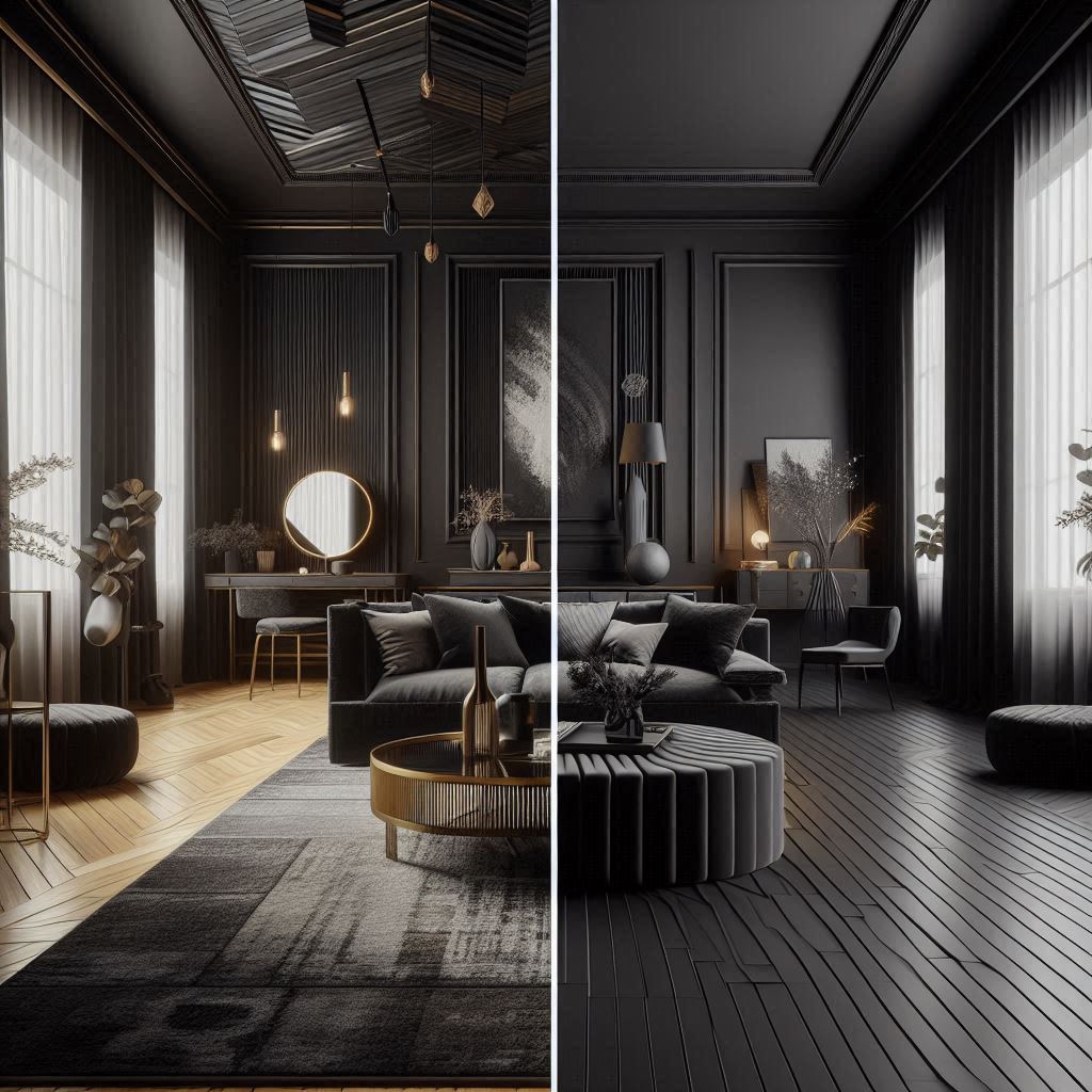
(“Dark Paint Colors That Work (And Ones That Don’t!)”)
🎨 BONUS: Designer Paint Secrets
- “Always test samples on multiple walls—light changes everything!”
- “Eggshell finish hides flaws; satin is best for kitchens.”
- “Paint ceilings 50% lighter than walls to avoid a ‘boxed-in’ feel.”
Pin this for your next paint project! Which color will you try? 🎨 #PaintLikeADesigner”